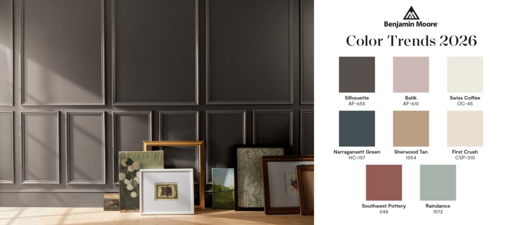
A Shift Away From Safe Neutral Walls
For years most Toronto homes followed the same formula — light gray, beige, or off-white walls. These colors felt safe and helped spaces look bright, but they often lacked personality. Recently we’ve seen a clear shift. Homeowners want interiors that feel designed, not just freshly painted. Color of the Year releases from major paint brands usually signal where design is heading. Shades like Silhouette reflect a move toward deeper, more sophisticated spaces that focus on atmosphere rather than just brightness.
Why Dark Colors Are Becoming More Popular
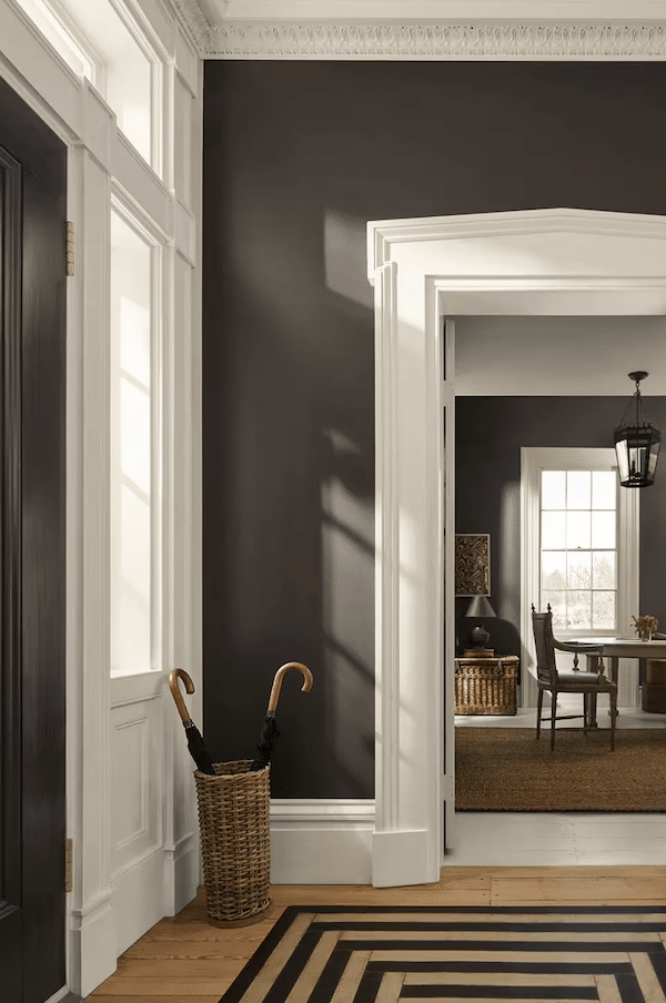
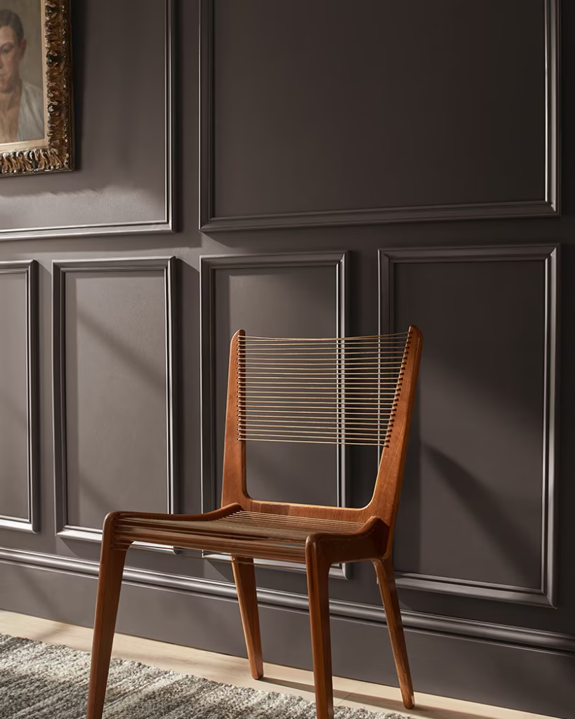
There’s a long-standing belief that dark walls make rooms look smaller. In practice, darker tones often create the opposite effect. They add depth, soften edges, and make spaces feel layered. This is one reason luxury condos, boutique hotels, and designer homes frequently use deeper palettes. Instead of flat walls, the room feels intentional and finished. In Toronto homes, we’re seeing more requests for dark accent walls, home offices, dining rooms, and full living spaces painted in richer tones.
What Makes Silhouette Different
Silhouette stands out because it balances boldness with warmth. It doesn’t feel cold or harsh. Instead, it creates a calm, cozy atmosphere that works well with modern interiors. When paired with white furniture, light wood flooring, or metal fixtures like brass and gold, the contrast immediately elevates the space. Even simple rooms start to feel more custom and high-end. This is why many homeowners try the trend first with a feature wall and later expand it into larger areas.
The Practical Benefits of Dark Walls
Beyond aesthetics, darker colors can be more practical for everyday living. Light walls tend to highlight scuffs, patches, and minor drywall imperfections. Deeper tones are more forgiving, especially in high-traffic areas. For families, condos, and busy households, this makes dark paint a smart choice — not just a design statement.
Professional Application Matters More With Dark Paint
From a painter’s perspective, trending colors like Silhouette require proper preparation. Surface repairs, correct primer, and consistent application are essential to achieve a smooth finish. Dark colors reveal uneven coverage more easily than light ones. Professional techniques — whether spray or roll — help ensure the final result looks clean and intentional rather than patchy. This is often the difference between a room that feels dramatic in a good way and one that feels unfinished.
Where Toronto Homeowners Are Using This Trend
We’re seeing Color of the Year shades used most often in:
Living rooms
Feature walls behind sofas or fireplaces create depth without overwhelming the space.
Home offices
Darker tones help reduce visual distractions and create a focused environment.
Bedrooms
Deep colors make bedrooms feel calmer and more comfortable.
Dining areas
Rich palettes add warmth and a more elevated atmosphere for entertaining.
Is This Trend Here to Stay?
Design trends always evolve, but the move toward richer interiors is clearly growing. Homeowners are becoming more confident using color to express style and create mood. Safe neutrals will always exist, but they’re no longer the only option. Shades like Silhouette show how paint alone can transform a space without major renovations.
Thinking About Trying the Color of the Year?
If you’re planning an interior update and want a space that feels more custom, modern, and sophisticated, deeper tones are worth exploring. Even one accent wall can dramatically change how a room feels.
At Prime Painting Toronto, we help homeowners choose trending colors and apply them with a smooth, professional finish so the result looks intentional and long-lasting.
Book your estimate: 647-404-8962